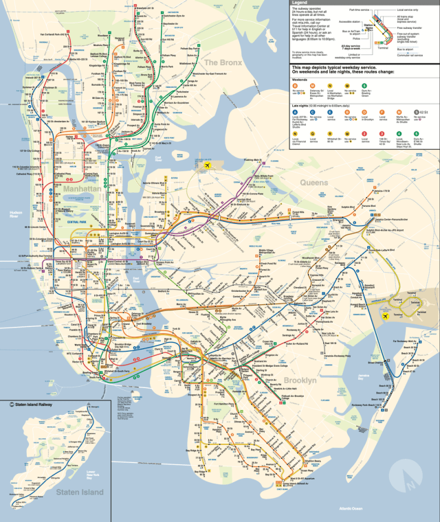
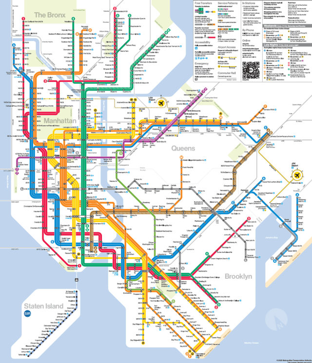
The Metropolitan Transportation Authority recently revealed a revamped map of the city’s subway system that takes its cues from a 1970s throwback that was cheered by design connoisseurs and reviled by many traditionalists. It is the first major overhaul of the subway map to be introduced by the authority in almost 50 years. The current version (above) is serviceable, but takes time to master. The new version (below) is colorful and much easier to read.
“The new map — a brightly colored variation on the current version that sacrifices some geographic detail for clarity — is reminiscent of the 1972 Unimark map, a modernist streamlining of the subways that straightened the curvy contours of the system. The map was short lived, replaced in 1979 by a version resembling the current one.”


