Change
But start slowly, because direction is more important than speed.
Sit in another chair, on the other side of the table.
Later on, change tables.
When you go out, try to walk on the other side of the street. Then change your route, walk calmly down other streets, observing closely the places you pass by.
Take other buses. Change your wardrobe for a while; give away your old shoes and try to walk barefoot for a few days – even if only at home.
Take off a whole afternoon to stroll about freely, listening to the birds or the noise of the cars.
Open and shut the drawers and doors with your left hand.
Sleep on the other side of the bed. Then try sleeping in other beds.
Watch other TV programs, read other books, live other romances – even of only in your imagination.
Sleep until later. Go to bed earlier.
Learn a new word a day.
Eat a little less, eat a little more, eat differently; choose new seasonings, new colors,
things you have never dared to experiment.
Lunch in other places, go to other restaurants, order another kind of drink
and buy bread at another bakery.
Lunch earlier, have dinner later, or vice-versa.
Try something new every day: a new side, a new method, a new flavor,
a new way, a new pleasure, a new position.
Pick another market, another make of soap, another toothpaste.
Take a bath at different times of the day.
Use pens with different colors.
Go and visit other places.
Love more and more and in different ways. Even when you think that the other will be frightened, suggest what you have always dreamed about doing when you make love.
Change your bag, your wallet, your suitcases, buy new glasses, write other poems.
Open an account in another bank, go to other cinemas, other hairdressers,
other theaters, visit new museums.
Change. And think seriously of finding another job, another activity,
work that is more like what you expect from life, more dignified, more human.
If you cannot find reasons to be free, invent them: be creative.
And grab the chance to take a long, enjoyable trip – preferably without any destination.
Try new things. Change again. Make another change. Experiment something else.
You will certainly know better things and worse things than those you already know, but that does not matter. What matters most is change, movement, dynamism, energy.
Only what is dead does not change – and you are alive.
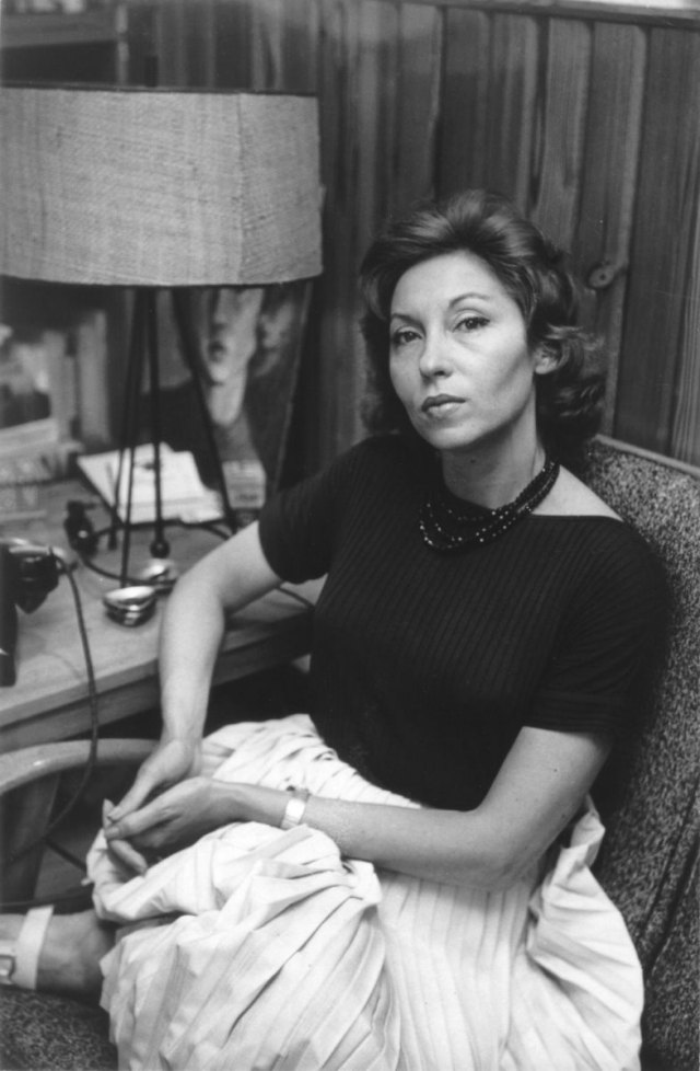
—Clarice Lispector