What Do Maps Tell Us ?

These extraordinary maps are created by a brilliant group of map geeks at the University of Sheffield with help from computer wiz Mark Newman from the University of Michigan. The collection of 700 world maps uses equal area cartograms, where territories are re-sized on each map according to a particular variable. You can find the amazing maps, and much more, at their website Worldmapper

All images © Copyright SASI Group (University of Sheffield) and Mark Newman (University of Michigan)

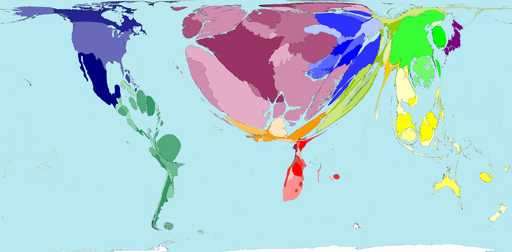
Tourist Destinations

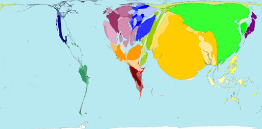
World Popoulation Year 1AD

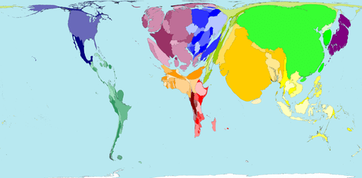
World Population 1900

International Immigration

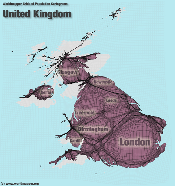
USA Population

.

This entry was posted in Maps. Bookmark the permalink.

Leave a Reply

Fill in your details below or click an icon to log in:

WordPress.com Logo

You are commenting using your WordPress.com account. Log Out /  Change )

Twitter picture

You are commenting using your Twitter account. Log Out /  Change )

Facebook photo

You are commenting using your Facebook account. Log Out /  Change )

Connecting to %s

This site uses Akismet to reduce spam. Learn how your comment data is processed.