
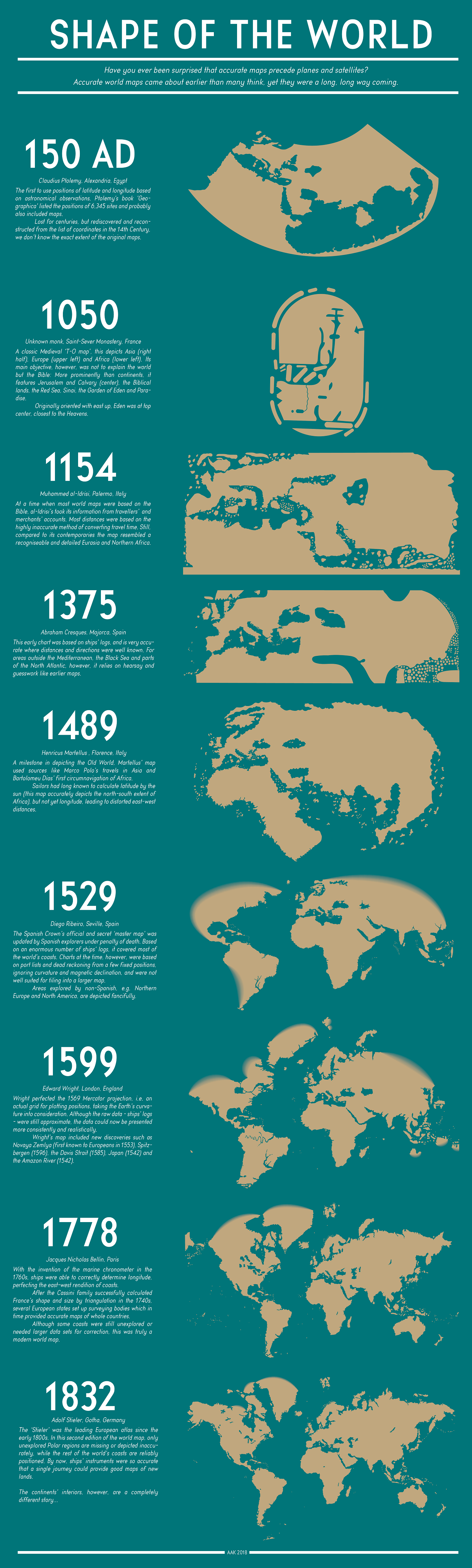
The fascinating infographic below explores how the view of our planet has evolved over the last 1,800 years. When most of us picture a world map, we likely still envision some variation of the 16th century Mercator projection even though it is wildly distorted. Fortunately, satellite technology has enabled contemporary cartographers to create more accurate images of our planet.


Thank you for sharing this cartographic jem.