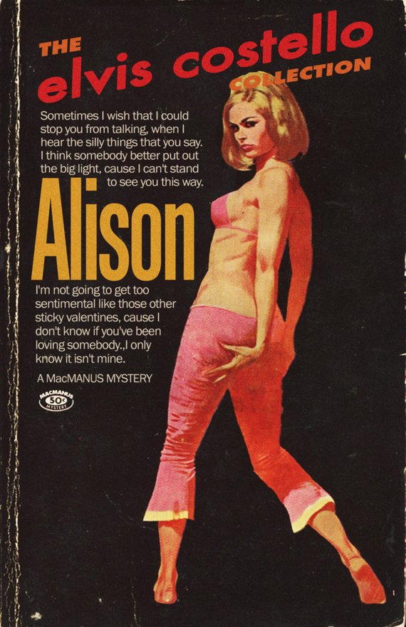
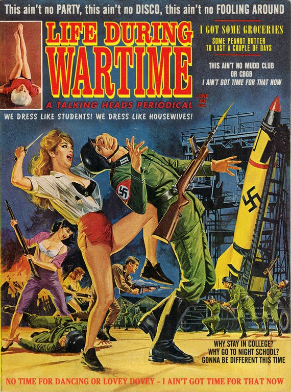
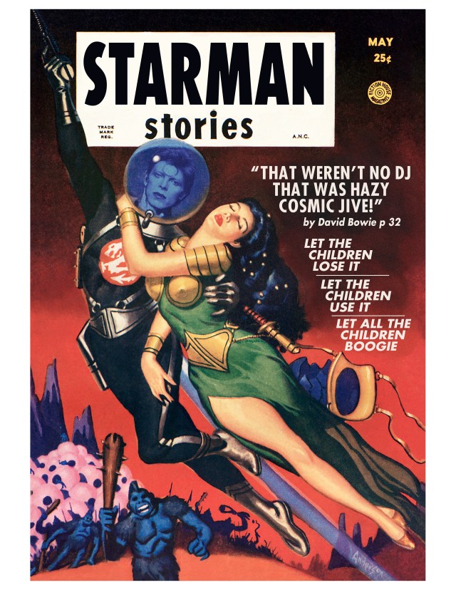
Screenwriter Todd Alcott, creates these wonderful digital mashups that combine the language of pop music and the visual language of 20th century pulp fiction paperbacks.
While Alcott finds many of his vintage book covers online, he still discovers a few gems in secondhand bookstores and has a soft spot for the battered originals.
I’d never understood pulp design until I started this project. As I started looking at it, I realized that the aesthetic of pulp is so deeply attached to its product that it’s impossible to separate the two. And that’s what great design is, a graphic representation of ideas. When I started examining the designs, to see why some work and some don’t, I was overwhelmed with the sheer amount of artistry involved in the covers. Pulp was a huge cultural force, there were dozens of magazines and publishers, cranking out stuff every month for decades, detective stories and police stories and noir stories and mysteries. It employed thousands of artists, writers and painters and illustrators. And the energy of the paintings is just off the charts. It had to be, because any given book cover had to compete with the ten thousand other covers that were on display. It had to grab the viewer fast, and make that person pick up the book instead of some other book. I love all kinds of midcentury stuff, but nothing grabs you the way a good pulp cover does.


