

Ways to Disappear
|
|
Ways to Disappear
|
|

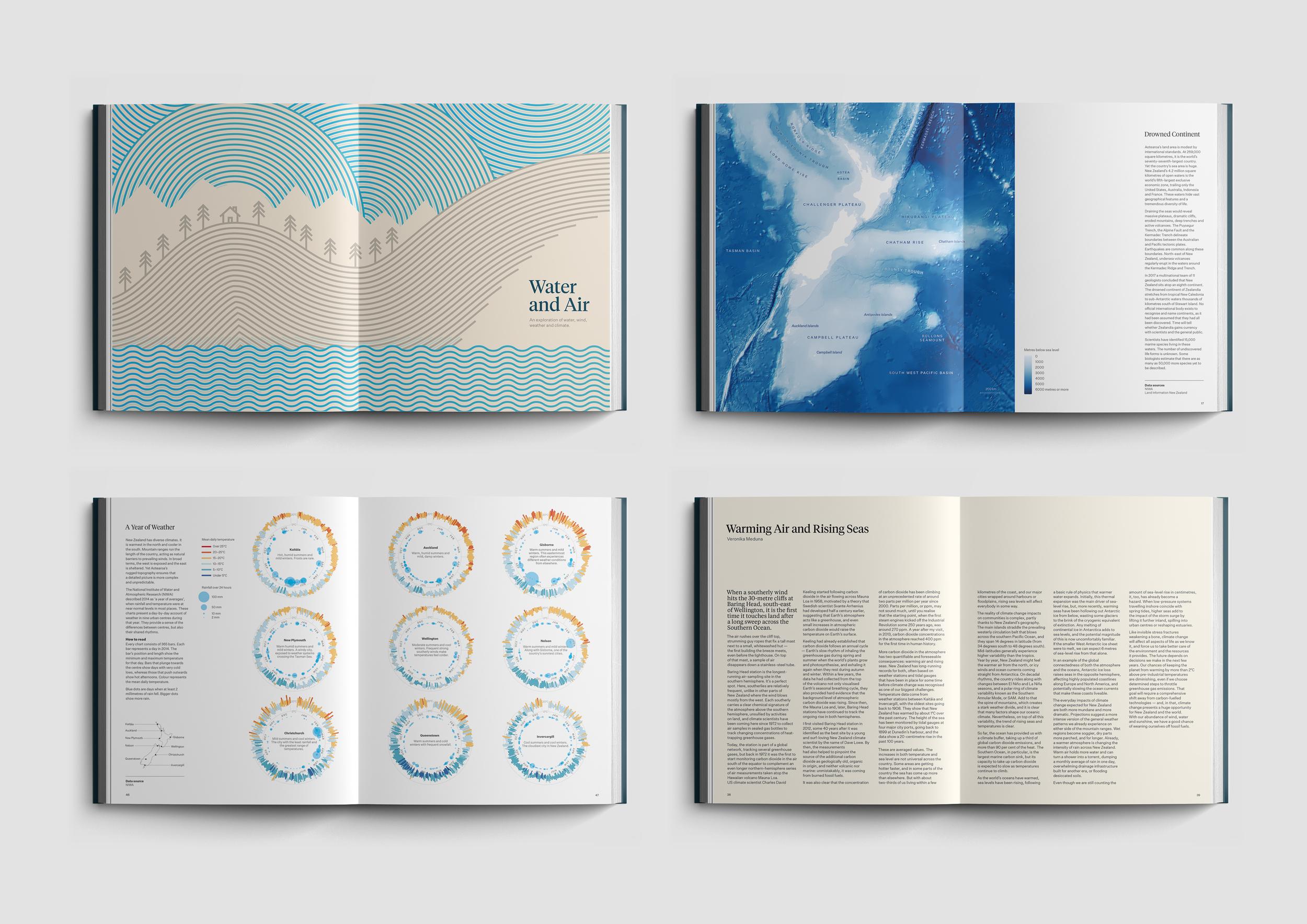
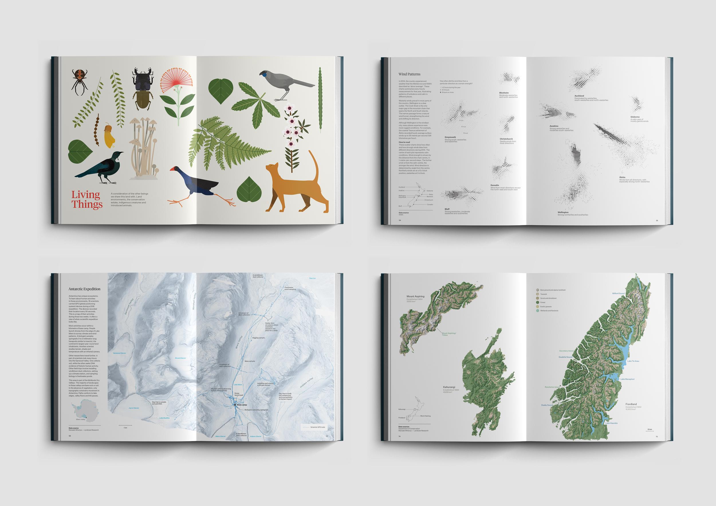
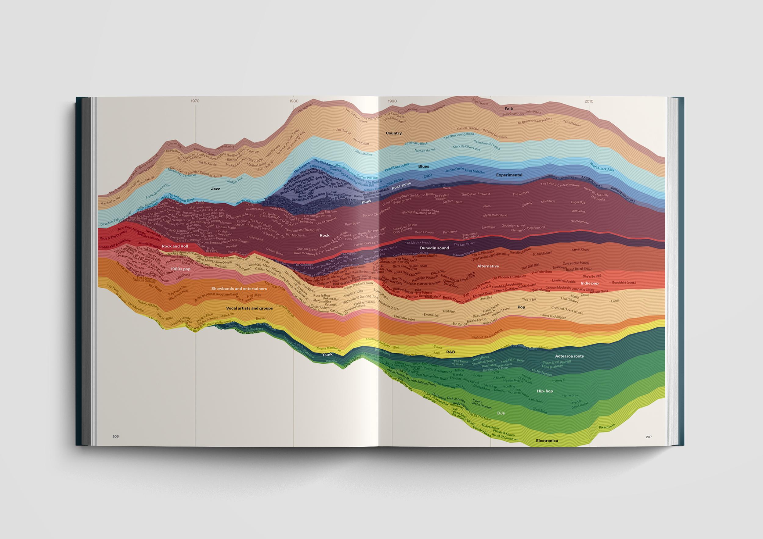
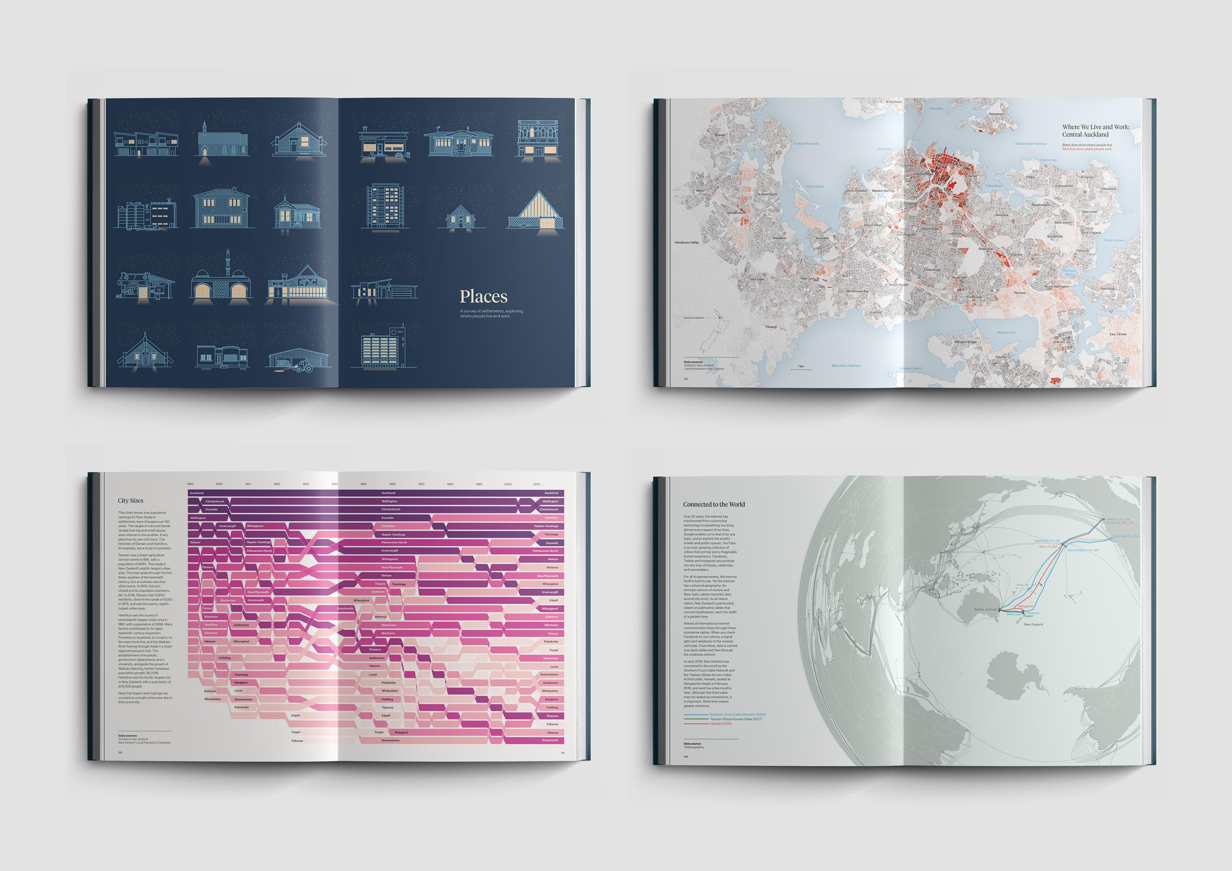
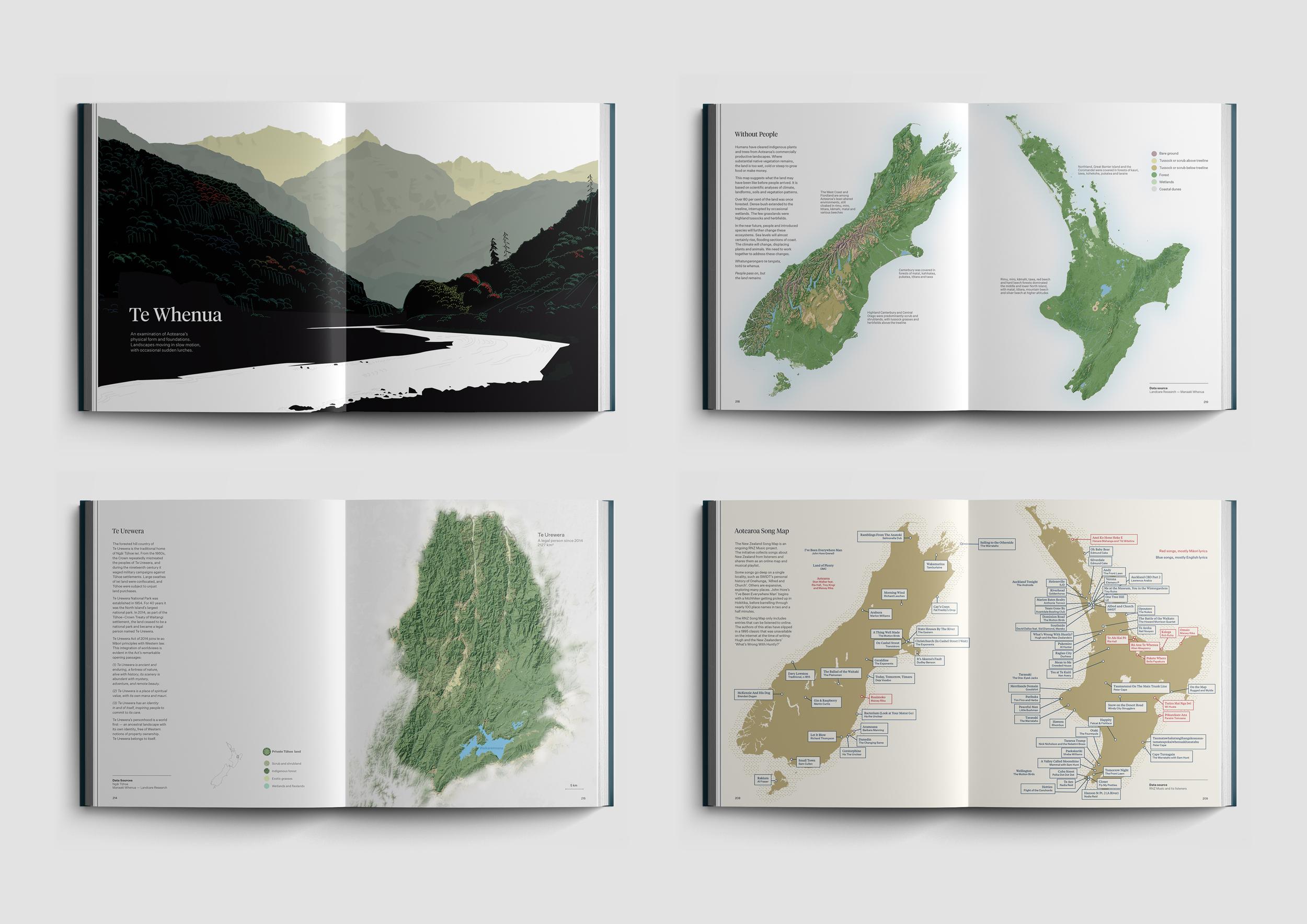
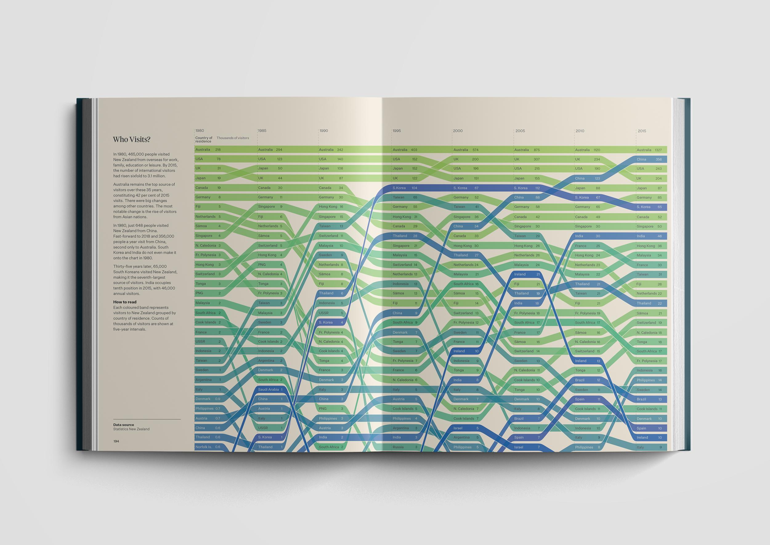
In case it may have slipped your notice, I have a bit of a thing for New Zealand, or Aotearoa as the Māori people call it. I recently stumbled upon We Are Here which is an atlas of Aotearoa – a book that helps New Zealanders make sense of their country, to grasp the scale, diversity and intricacies of Aotearoa. Designed by Tim Denee and Chris McDowall, this book features a gorgeous collection of maps, data visualizations, and illustrations. It’s an excellent non-tourist oriented introduction to the most beautiful and diverse nation on Earth.


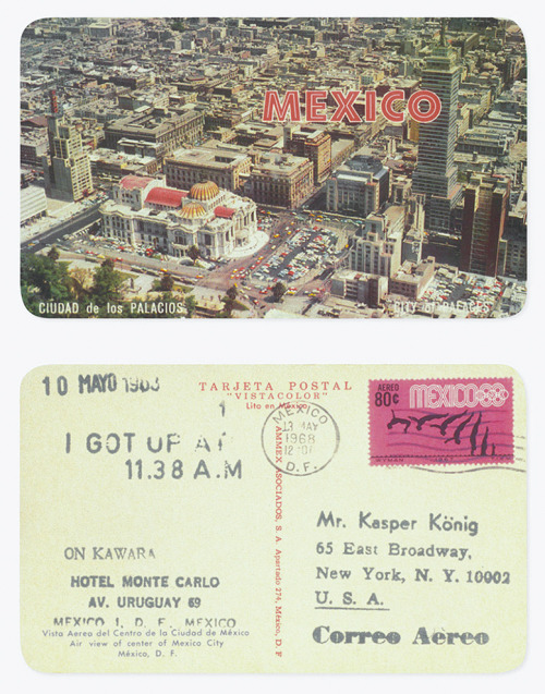
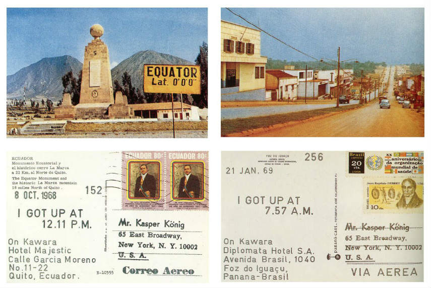
On Kawara was a 20th century Japanese conceptual artist who was influential in the New York art scene. Although he was widely know for his “Today” series or “Date Paintings,” many considered that the most personal and intimate of his works was “I GOT UP AT.” The series is part of a continuous piece produced by the artist between 1968 and 1979 in which each day he sent 2 different friends or colleagues a picture postcard, each stamped with the exact time he arose that day and the addresses of both sender and recipient. The length of each correspondence ranged from a single card to hundreds sent consecutively over a period of months.


“Mutations”
by
Jorge Luis Borges
Translated by Andrew Hurley
In a hallway I saw a sign with an arrow pointing the way, and I was struck by the thought that that inoffensive symbol had once been a thing of iron, an inexorable, mortal projectile that had penetrated the flesh of men and lions and clouded the sun of Thermopylae and bequeathed to Harald Sigurdson, for all time, six feet of English earth.
Several days later, someone showed me a photograph of a Magyar horseman; a coil of rope hung about his mount’s chest. I learned that the rope, which had once flown through the air and lassoed bulls in the pasture, was now just an insolent decoration on a rider’s Sunday riding gear.
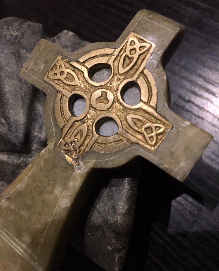
In the cemetery on the Westside I saw a runic cross carved out of red marble; its arms splayed and widened toward the ends and it was bounded by a circle. That circumscribed and limited cross was a figure of the cross with unbound arms that is in turn the symbol of the gallows on which a god was tortured—that “vile machine” decried by Lucían of Samosata.
Cross, rope, and arrow: ancient implements of mankind, today reduced, or elevated, to symbols. I do not know why I marvel at them so, when there is nothing on earth that forgetfulness does not fade, memory alter, and when no one knows what sort of image the future may translate it into.

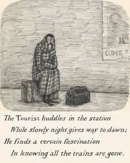
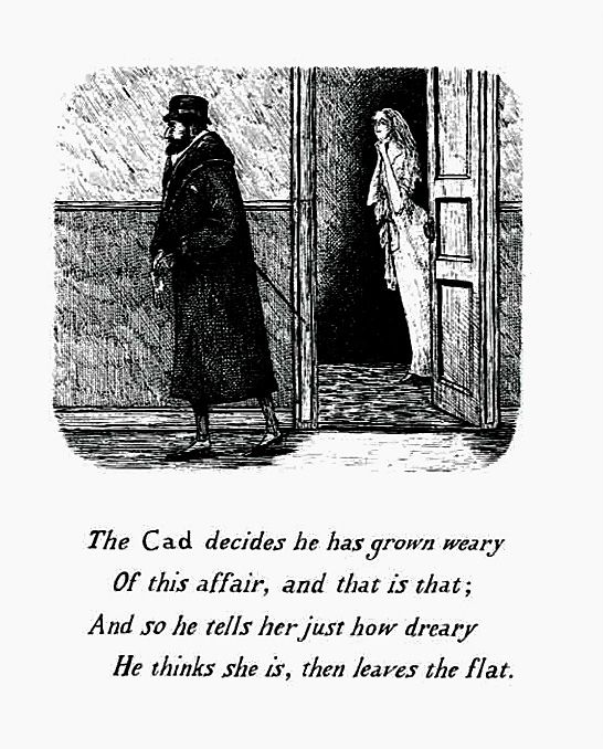
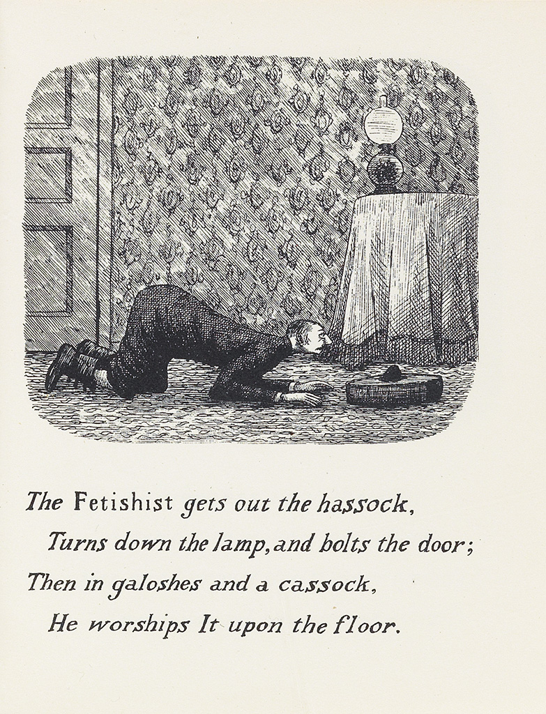
The illustration above, appeared in The Fatal Lozenge which was Edward Gorey’s first published “alphabet book”. In the book series, each letter of the alphabet is represented by a character which appears in a four line poem and each poem is accompanied by a single illustration. Other than being in alphabetical order, the individual poems do not relate to each other, but instead each page turn reveals a new character who is caught up in some sordid activity or misfortune.
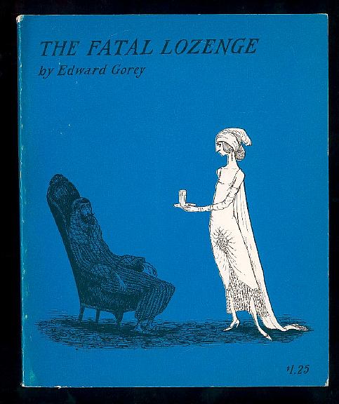
The first edition of The Fatal Lozenge was published as a small paperback volume with $1.25 printed on the cover. On the second printing of book the price was increased to to $1.75, but otherwise the edition are identical.
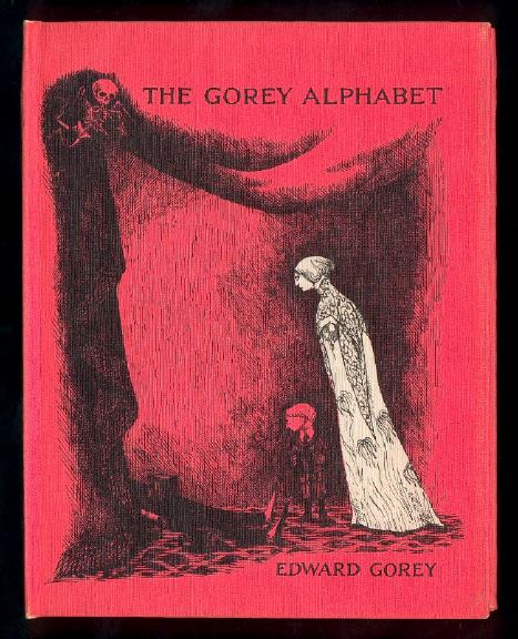
In 1961, an edition of The Fatal Lozenge was published in London under the Constable imprint. For the British first edition, the title was changed to The Gorey Alphabet and new cover art was created. The British first was issued as cloth hard cover book with no dust jacket and has intense pink covers.


I recently stumbled upon a link to this issue of Amazing Stories magazine from 1927. What jumped out for me was the inclusion in this issue of H.P. Lovecraft’s of The Colour Out of Space and H.G. Wells’ The War of the Worlds. How cool is that. You can read the original publication and the entire issue can be downloaded here


DOLOR
Theodore Roethke
I have known the inexorable sadness of pencils,
Neat in their boxes, dolor of pad and paper weight,
All the misery of manilla folders and mucilage,
Desolation in immaculate public places,
Lonely reception room, lavatory, switchboard,
The unalterable pathos of basin and pitcher,
Ritual of multigraph, paper-clip, comma,
Endless duplication of lives and objects.
And I have seen dust from the walls of institutions,
Finer than flour, alive, more dangerous than silica,
Sift, almost invisible, through long afternoons of tedium,
Dropping a fine film on nails and delicate eyebrows,
Glazing the pale hair, the duplicate grey standard faces.

As I have mentioned more than a few times over the years, I was a voracious reader of Ray Bradbury’s novels and short stories as a kid. So, I was excited to see that the American Writers Museum in Chicago is highlighting Ray Bradbury, perhaps best known as the author of Fahrenheit 451 and The Martian Chronicles, online and in-person, now through spring 2022. Check out the excellent introductory three-minute trailer for the exhibition featuring fellow sci-fi and fantasy authors John Scalzi, Rachel Bloom, and Maurice Broaddus below.
NB: If subscribe to TPTP through email, some videos are not showing up in the feed. You can access them by clicking on the blog’s short link at the bottom of your email.


