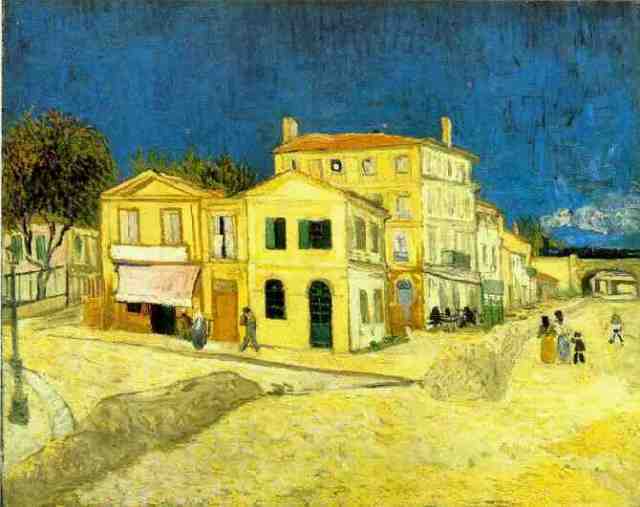
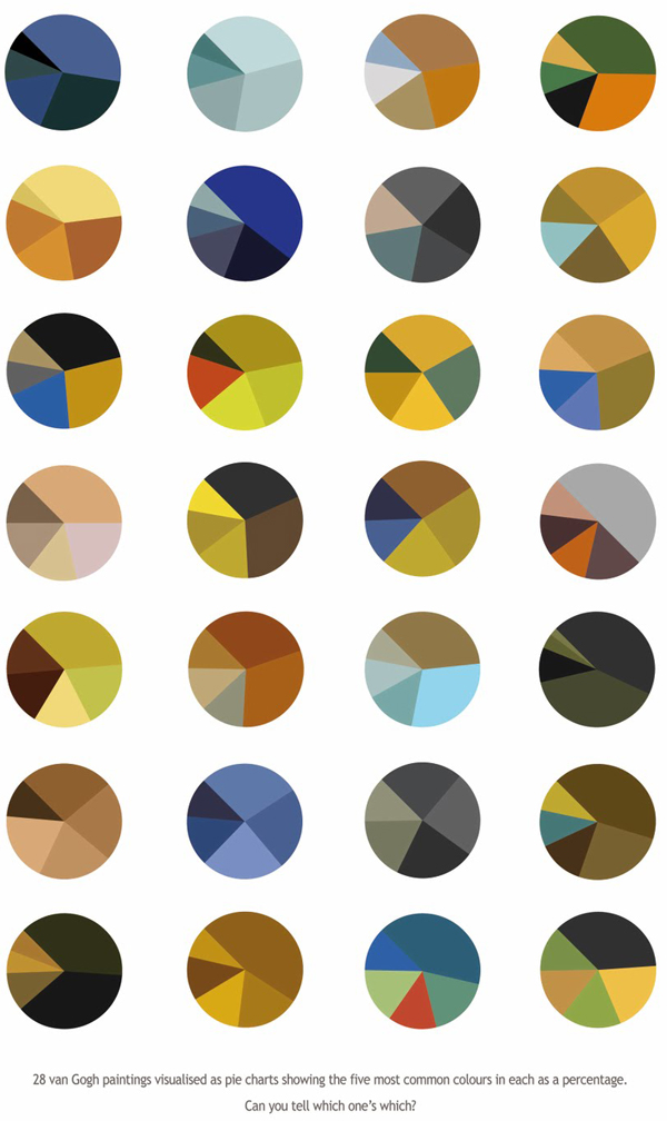
British artist Arthur Buxton is always searching for novel ways to explore art. His color- study pie charts of well known Van Gogh works deconstruct the painter’s color use. Each one represents the color distribution in a famous Van Gogh painting. It’s up to you to determine which one.
“I know you lot are fans of new ways of visualizing data. As far as I know, I’ve come up with a novel way of looking at colour schemes. The pie charts are designed to be visually pleasing but also function as a colour trend visualization tool. They represent famous paintings, portraying the five most prominent colours in each as a percentage.”
Learn more about Arthur Buxton at his website.


Great info.