Is It Wrong

600w__wrongsubway_03_b-2126

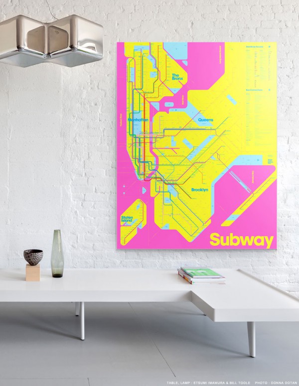
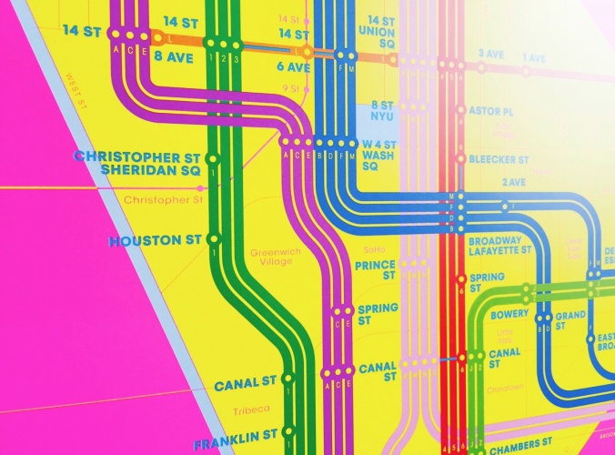
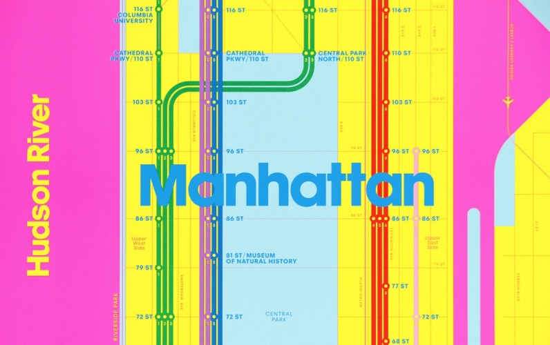
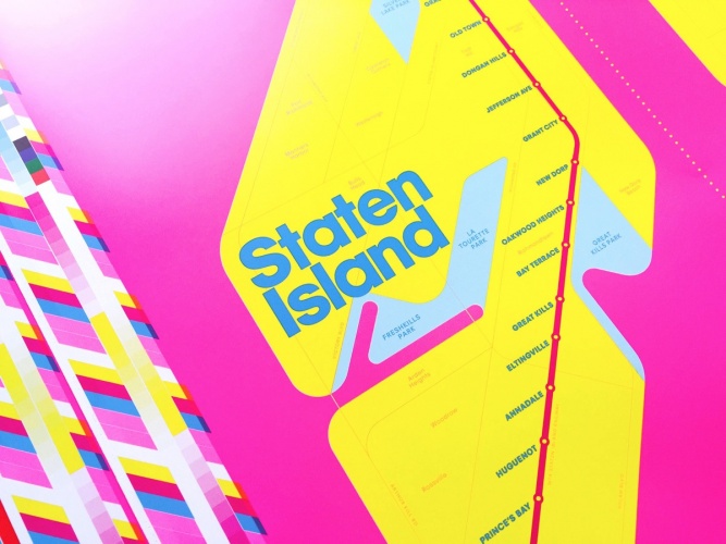
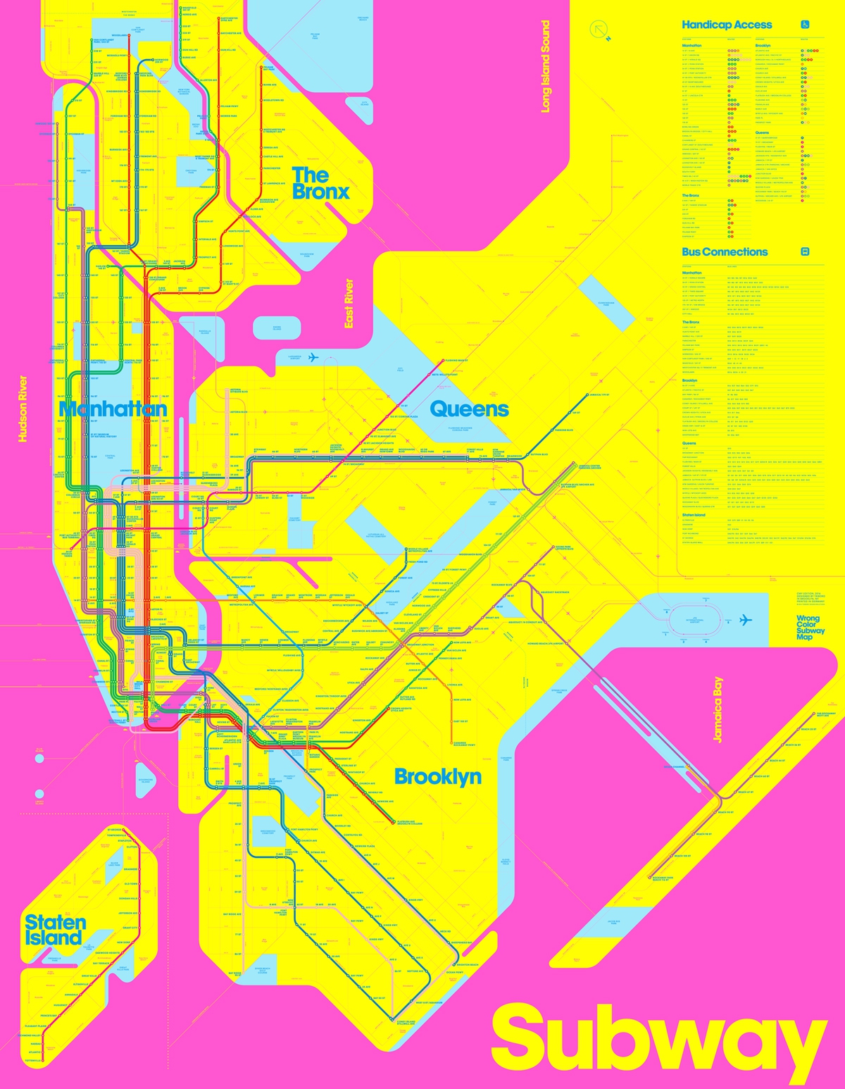
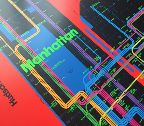
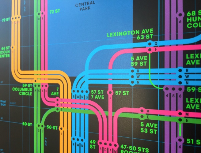
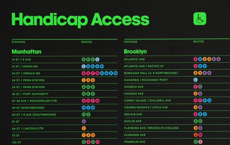
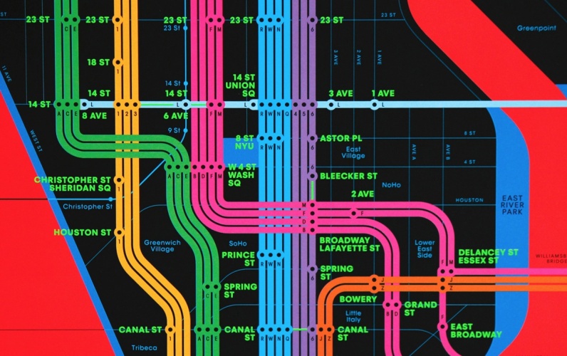
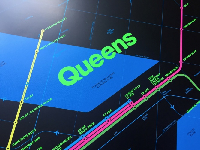
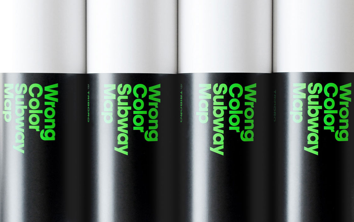
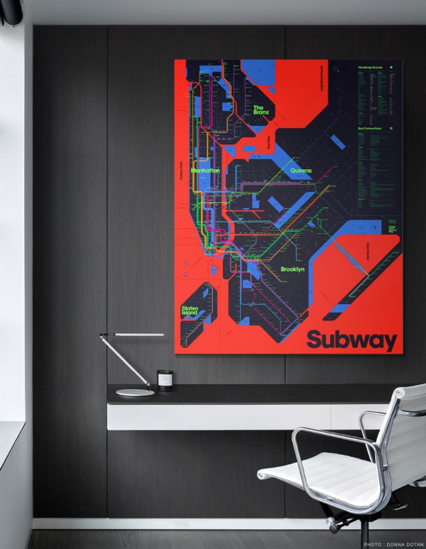
I haven’t quite made up my mind about these new takes on the New York City subway map from the Brooklyn-based Triboro Design team. The duo explain their design choices by saying, “we chose the most inappropriate colors that we could think of. Meanwhile every inch of the poster has been redesigned to make it more refined, precise, and (to our eyes) beautiful.”  You can see more detail and purchase prints at Triboro Design.

600w__wrongsubway_09-2068

wrongsubway_cmy_06-crsite-676x500

wrongsubway_cmy_02-crsite-796x500

wrongsubway_cmy_08-crsite-667x500

1200w__wrongsubway_cmy_01-2034

1200w__wrongsubway_rgb_01-1938

wrongsubway_rgb_08-crsite-568x500

wrongsubway_rgb_07-crsite-656x500

wrongsubway_rgb_05-crsite-796x500

wrongsubway_rgb_04-crsite-796x500

wrongsubway_rgb_09-crsite-667x500

wrongsubway_rgb_03n-2118

This entry was posted in Art, Maps, Public Transport, USA and tagged , , , . Bookmark the permalink.

Leave a comment

This site uses Akismet to reduce spam. Learn how your comment data is processed.