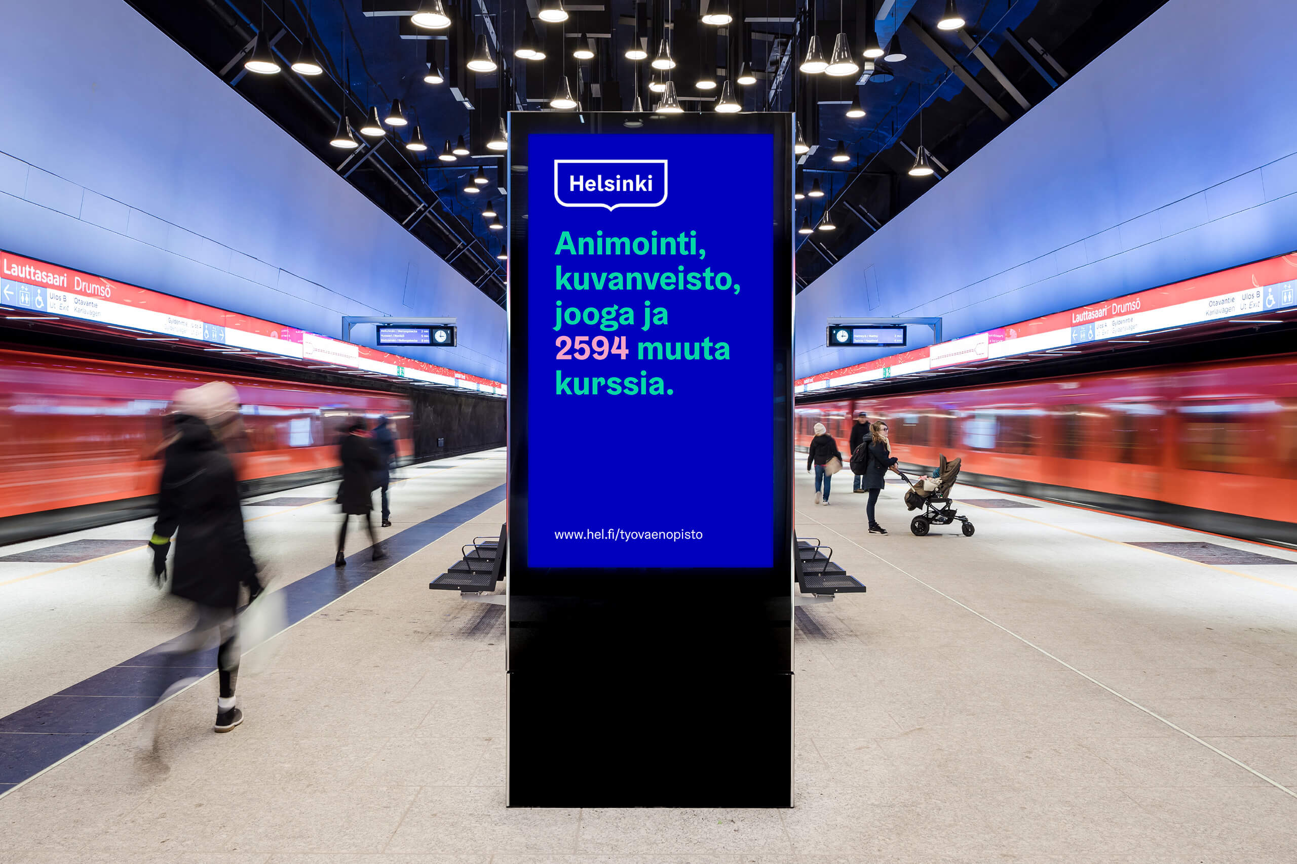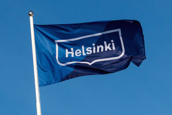
I was surprised to discover that up until very recently Helsinki never had a single or consistent brand system. Last summer, Finland’s capital finally commissioned the creative group Werklig to develop a contemporary brand design that would work across all municipal agencies.
![]()
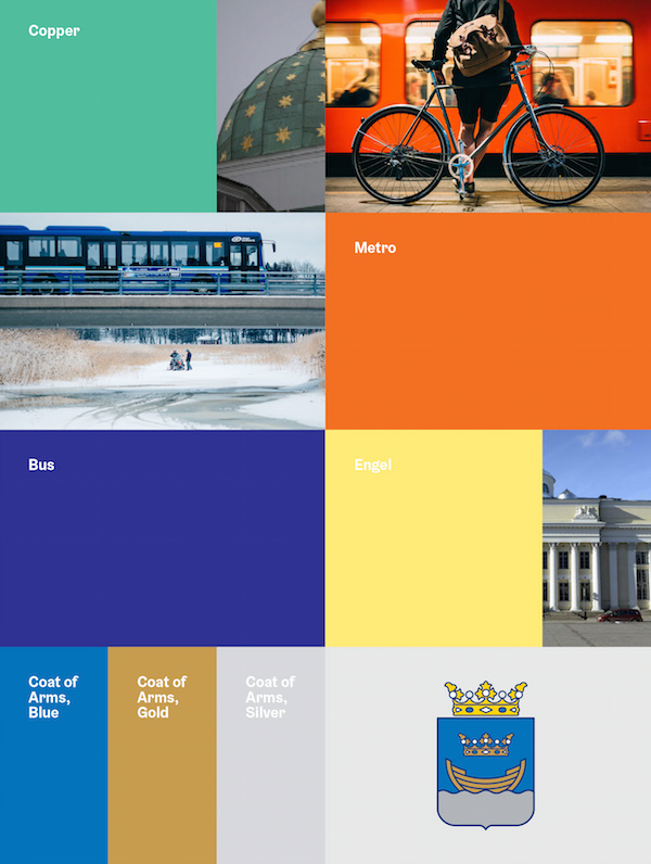
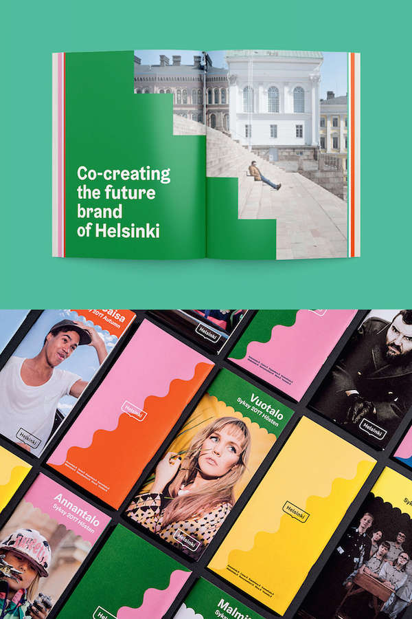
Werklig was tasked with creating a consistent look that had aesthetic appeal. was recognizable for residents and visitors alike, and worked graphically. The agency chose to base the new brand on Helsinki’s historic city crest, the cupola of the Helsinki Cathedral, the coastal geography, and the color palette of the municipal transit companies.
![]()
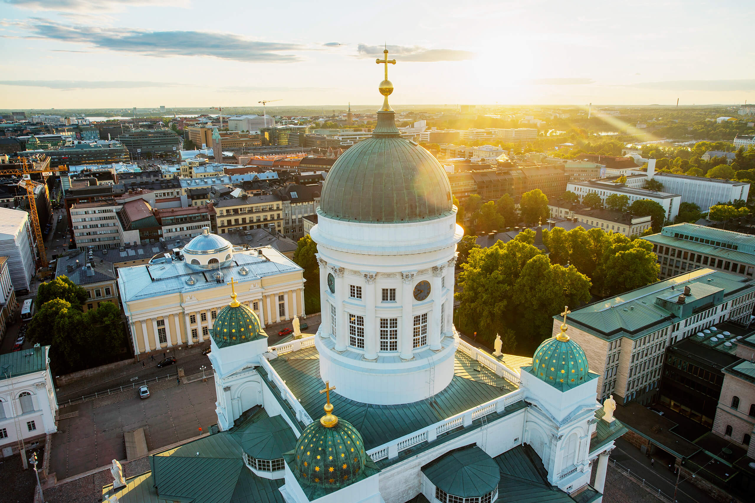
The resulting branding is cohesive and consistent, but doesn’t say Helsinki to me. A city’s identity is so much more than fonts and graphic design. While I haven’t spent much time in Helsinki recently, when I think of the city what resonates the most to me is the natural setting, the architecture, the urban topology, the history, and the big northern skies.