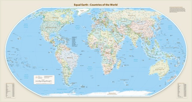
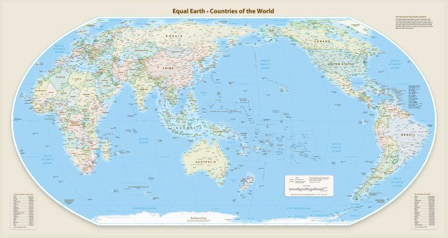
Most of us were educated to believe in a wildly inaccurate world map. Odds are that you have accepted the standard Mercator projection as the actual map of the world. But it’s completely misleading, making Africa look about the same size as Greenland. In reality, Africa is a 14 times bigger! You could fit the U.S., China, India, Japan, Mexico, and much of Europe inside it and still have room to spare.
Fortunately, there’s a better map available now: the Equal Earth projection. It gets the sizes right, accurately showing just how big Africa is and presenting continents in shapes that are closer to how they look on a globe.
The Correct the Map campaign challenges the distortion of Africa’s true size on world maps, aiming to empower global understanding and respect for the continent’s significance.


