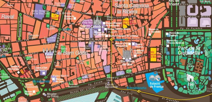
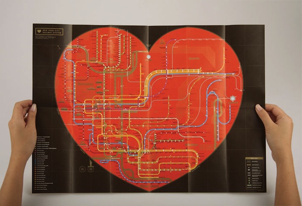
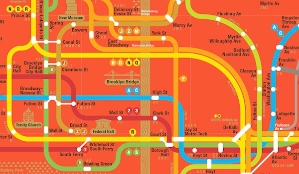
designing metropolitan subway system maps to make them easily understood for both locals and visitors is a challenge for any graphic designer or cartographer. It’s equally challenging to create city transit maps that reflect a municipal identity.
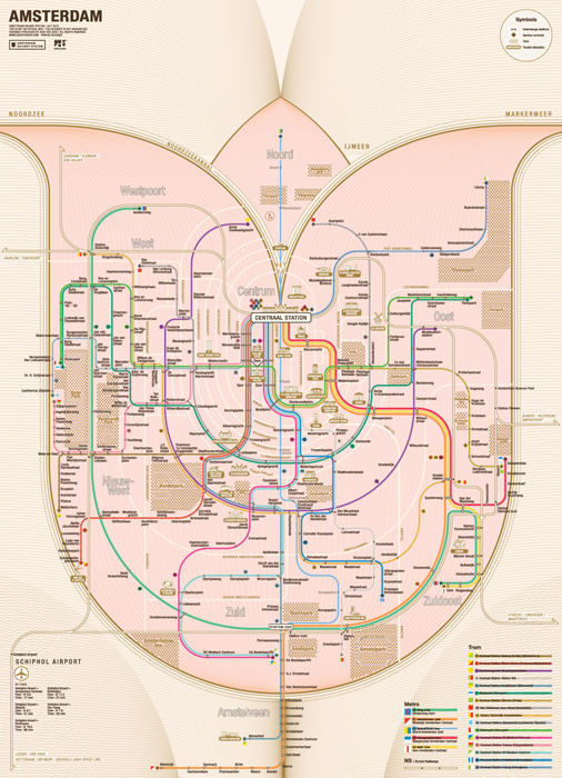
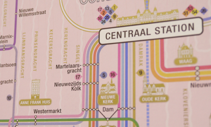
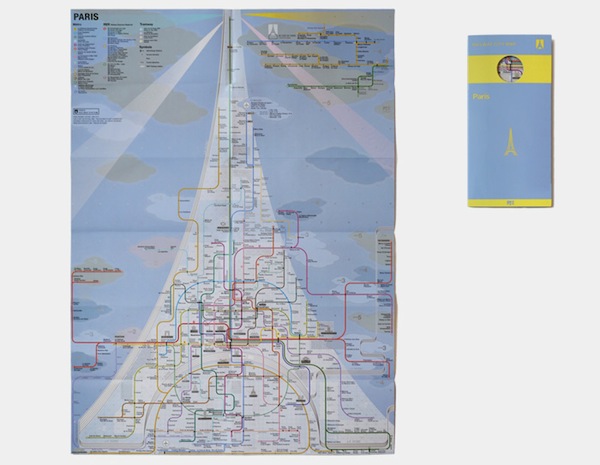
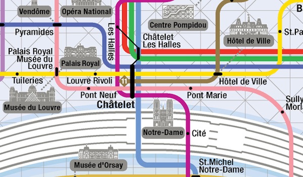
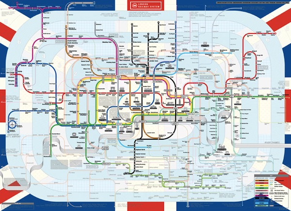
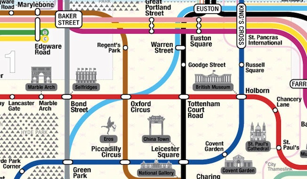
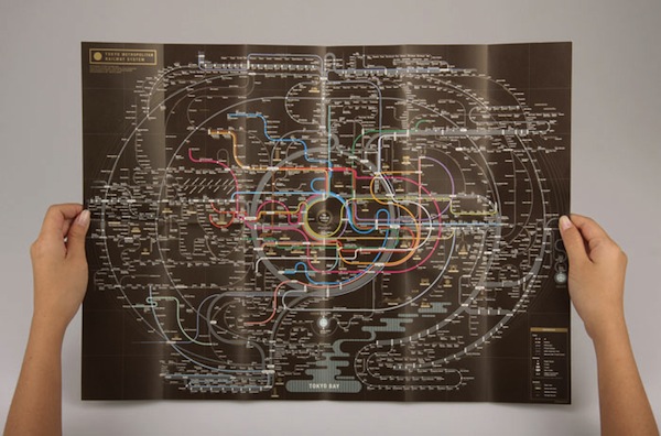
Zero Per Zero, a Seoul, Korea-based graphic design studio has launched a project to incorporate symbolic elements of cities into transit maps while attempting to preserve cartographic clarity. Each of their maps starts with a symbol for the city—a tulip for Amsterdam, a heart for NYC, the Eiffel Tower for Paris.

If you want to see more maps, or buy maps or prints, visit the Zero Per Zero website.