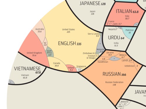
The National Geographic’s senior graphics editor Alberto Lucas López created this wonderful pie chart to illustrate the proportional representation of the world’s twenty three most spoken languages. López based the graphic on native speakers, with each language marked by black borders. You can see more of the project on this website.
Categories
- Africa
- Air Travel
- Animation
- apps
- Architecture
- Art
- Asia
- Books
- Bookstore Tourism
- Canada
- Car rentals
- Cartography
- Comics
- ebooks
- Europe
- Film
- Freedom of Speech
- History
- Hotels
- Libraries
- Maps
- Middle East
- movies
- Museums
- Music
- Photography
- Public Transport
- Restaurants
- South America
- Tech
- Theater
- Tourism
- Travel Writing
- Uncategorized
- USA
- Writing
Share this Blog
Translate
-


