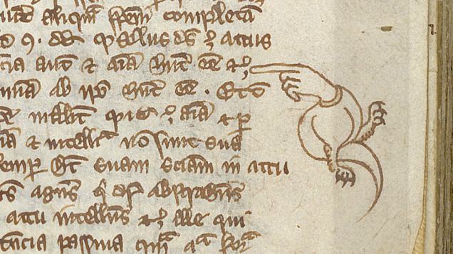
I have long been fascinated by medieval manuscripts, incunabula, and early books in general. Recently I stumbled upon a number of images that included manicules within text margins and thought —whence the manicule.
The manicule, ☛, is a typographic mark with the appearance of a hand with its index finger extending in a pointing gesture. Originally used for handwritten marginal notes, it later came to be used in printed works to draw the reader’s attention to important text.
The term manicule comes from Latin (maiculum) and means as much as small hand or pointing hand. The symbol is first used in the Domesday Book of 1086, which contained a comprehensive overview of all possessions and owners in England before and after 1066. It was commissioned by William the Conqueror for tax purposes. From then on, the symbol was used in the margins, margins of manuscripts, to indicate corrections or notes. This manicule was a popular symbol and they became more and more beautiful. Sometimes it was an ordinary bare index finger, sometimes with a beautiful cuff, sometimes with a crooked index finger.
After the printing press was introduced in the 15th century, the hand-drawn manicule continued to be used to indicate improvements to be made, or to point out an error in the text. Later, the pointing hand became more popular in publications, advertisements and signage. Even the U.S. Postal Service used the manipulative symbol when the letter was misdelivered and had to be returned to Sender .
In the 19th century the manicule became a popular typographic symbol . Today, the manicule is a standard typographic symbol intended to draw the reader’s attention to important text.


This post cheered up my morning!