

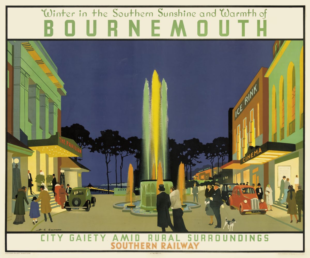
The modern poster dates back to the late 19th century when the printing industry perfected color lithography. This advance in printing allowed the whole new art form of color posters to flourish. Advertising agencies were quick to exploit the new poster art style. The travel tourism industry has used color poster art to communicate the advantages of a particular destination or mode of travel. Railways, cruise lines, ferries and airlines created many visually attractive and compelling travel posters.

I recently ran across a series of early 20th century British travel posters created by Henry George Gawthorn. Although he originally trained to be an achitect, early on Gawthorn focused on painting and drawing. Like many artists he found a consistent income from advertising artwork, especially travel posters. He often used flat colors in a distinctive art deco style that portrayed cosmopolitan and glamorous people at the beach, boating, or visiting a theatre.


They are very stylish and I love them. Wouldn’t mind framing a couple. That is SO Harrogate!
An excellent collection. I shall be visiting Bridlington next month.
I’ve always loved these posters: thanks for highlighting my neighbouring towns of Harrogate and Knaresborough.
Really cool finds
Thanks for sharing, these are gorgeous