
If you are a regular visitor to Travel Between The Pages. you are probably aware of my long interest in public transit systems and the maps that help us negotiate those services. I’m not sure where my fascination with public transit began, but my best guess would be riding the New York City subways as a small child. As an adult, I always try and explore new cities via their transit networks and I still study transit maps wherever I go.
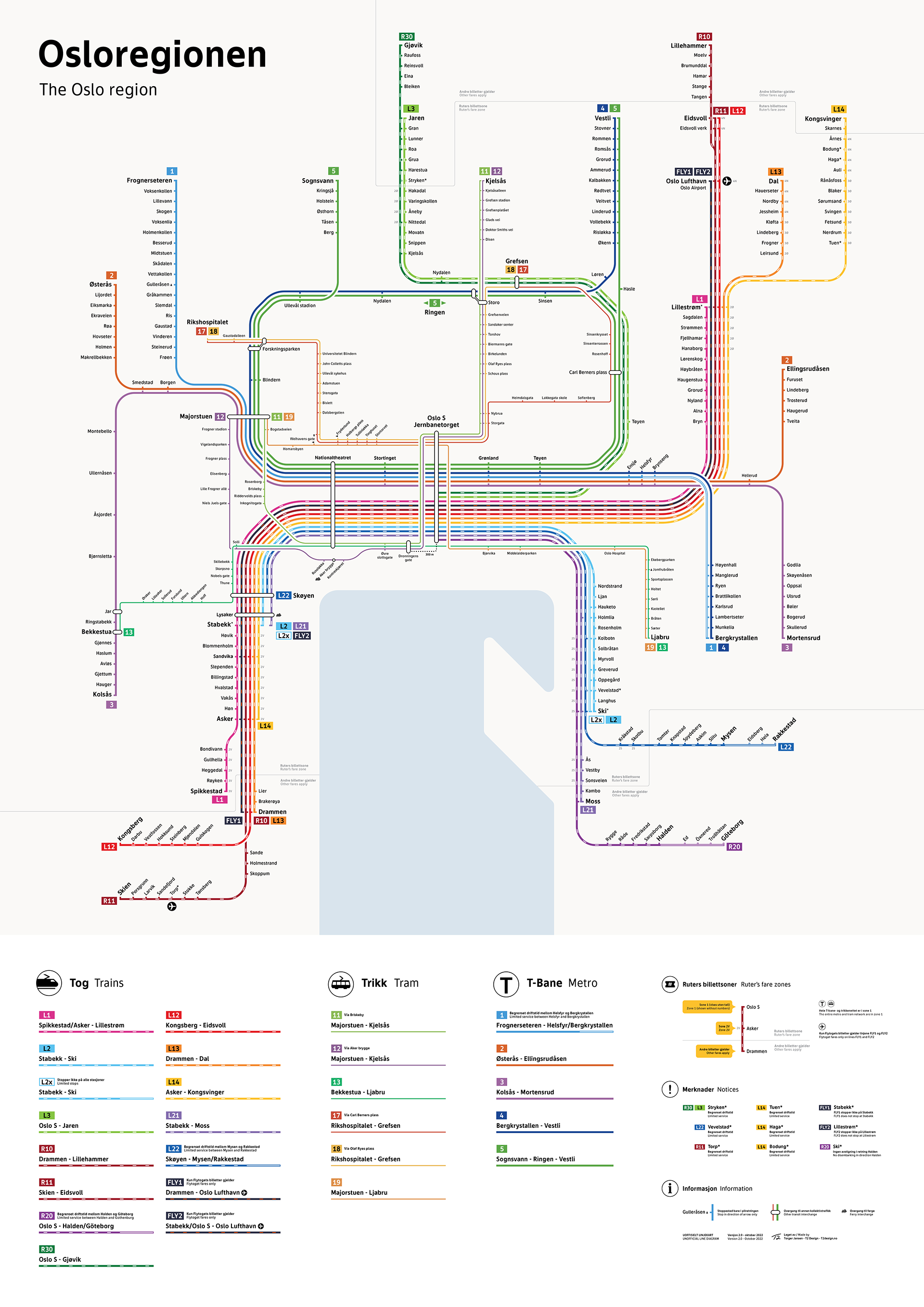
The beautifully designed regional transit map for Oslo, Norway above was created by designer Torger Jansen. In his 10-minute video below he explains how he designed an unofficial transit map that combines all three of Oslo’s public transportation networks (tram, metro, train) into a single diagram. His four main goals:
1. Showing all the lines on every network, thus making it easier to understand the service patterns.
2. Making it recognisable with the official line colours.
3. Compressing unnaturally long distances between stations.
4. Balancing aesthetics and accessibility. The diagram is clear and easy to read with minimal fuss.
As Jansen notes, this is not how a design process would work in the real world — there’s no user testing or competing stakeholders to please — but from a purely aesthetic and functional standpoint, it’s still an interesting challenge and puzzle to attempt to solve.
If the video does not open in your email, please click here.

