Meaning is a shaky edifice

Salman Rushdie // “But human beings do not perceive things whole; we are not gods but wounded creatures, cracked lenses, capable only of fractured perceptions. Partial beings, in all the senses of that phrase. Meaning is a shaky edifice we build out of scraps, dogmas, childhood injuries, newspaper articles, chance remarks, old films, small victories, people hated, people loved; perhaps it is because our sense of what is the case is constructed from such inadequate materials that we defend it so fiercely, even to the death.”


Posted in Books, USA, Writing | Tagged , | Leave a comment

Bookstore Tourism: Secret Bookshop Brooklyn

Hidden within an iconic New York City bodega in Brooklyn’s Greenpoint neighborhood you can find the newly launched Burnt Books. No secret passwords or handshakes are required to browse their stock of secondhand and collectible books; you just need find the bodega with the sign for the Green Discount Corp.. The speakeasy bookshop was opened in late July by Jason Mojica who owns the nearby comic book store Hey Kids Comics!. 

You can check out Burnt Books by heading to the storefront bodega, Green Discount Corp., at 1014 Manhattan Avenue near Green Street. The bodega and the bookstore are open seven days a week from 8:30AM to 9PM.


Posted in Books, Bookstore Tourism, Tourism, USA | Tagged , , , , | Leave a comment

Be Your Own Cartographer

Here at Travel Between The Pages world headquarters we’re always up for a clever city map generator. So, here’s the Pretty Mapp App  which is a fun way to create colorful local maps of your home town or anyplace that you visit. The palette and themes are fully customisable as well as the zoom and detail specifications for whipping up some quick and attractive cartographical renders with a birds-eye view.


Posted in apps, Maps, Tech | Tagged , , | Leave a comment

A Night at the Garden

As we face an existential crisis which challenges whether the United States will remain a democracy or sink into a cesspit of neo-Fascist, Christian White Nationalist repression, it is worth remembering our history and examining how close we came in the past.

“In 1939, 20,000 Americans rallied in New York’s Madison Square Garden to celebrate the rise of Nazism – an event largely forgotten from American history. A NIGHT AT THE GARDEN, made entirely from archival footage filmed that night, transports audiences to this chilling gathering and shines a light on the power of demagoguery and anti-Semitism in the United States.

A NIGHT AT THE GARDEN was directed and edited by Marshall Curry and was supported and released by Field of Vision. The film was nominated for a 2019 Academy Award for Best Documentary Short; it was also an official selection at the Sundance Film Festival and was part of a special screening and panel discussion at the New York Film Festival. It was released on 22 Alamo Theater screens across the country and at The IFC Center in NYC.”

NB: If the video fails to play, please visit our homepage here

Posted in Europe, Film, History, USA | Tagged , , | 1 Comment

Make Your Drive Fun

No one enjoys a boring road trip and we all love an excuse to make unscheduled stops along the way. Make My Drive Fun will make those drives a bit more spontaneous and fun. It’s a simple as inputting your place of departure and destination, and voila lots of attractions to visit on your route. If I only knew about the website when I was in New Zealand, I could have visited the Ondo Giant Noodle.


Posted in apps, Maps, Tech, Tourism | Tagged | 1 Comment

A Unique B & B Pop-Up

This charming adult pop-up book by Jan Pieńkowski’s was published in 1996 by Simon & Schuster. The book opens up into a house, decorated and inhabited by over fifty artistic works. A small guidebook tucked in over the staircase opens with “Dear Art Lover, Welcome to our historic home. Thank you for choosing Botticelli’s and have a nice stay. – Botticelli.”

Jan Pieńkowski was born in Warsaw, Poland, on August 8, 1936. He was first exposed to paper art in an air raid shelter, where his family had taken refuge from Nazi firebombing during the Invasion of Poland; a Polish soldier entertained the children by cutting newspapers into fanciful shapes. Displaced by the war, he and his parents were refugees in several countries, eventually settling in England. Pieńkowski’s childhood hardships would go on to influence his art. He has said in interviews that his illustration work allowed him to channel the frightening monsters of his youth into innocent playthings. Pieńkowski has often used his paper cut technique to illustrate traditional stories. The detailed silhouettes over brightly coloured backgrounds are enjoyed by children and adults alike.


Posted in Art, Books, Europe | Tagged , , | 2 Comments

Welcome to the AI Generation

It seems that each day we are introduced to yet another form of AI-generated art, literature, news, or advertising. This series of AI-generated travel posters, commissioned from research lab Midjourney for the luggage storage company Stasher, is the inevitable blend of travel advertising and poster art. Like most travel posters, Midjourney has evoked a idealized sense of place punctuated by recognizable landmarks or cultural cues.

While some of the posters in the series have a vague, washed-out sensibility, others are surprisingly evocative of the places that they represent. Still, I think that I will always prefer human-generated travel art.


Posted in Animation, Art, Europe, Tech, Tourism | Tagged , , , | Leave a comment

The Parable of the Blind

“The Parable of the Blind”

by

William Carlos Williams


This horrible but superb painting
the parable of the blind
without a red

in the composition shows a group
of beggars leading
each other diagonally downward

across the canvas
from one side
to stumble finally into a bog

where the picture
and the composition ends back
of which no seeing man

is represented the unshaven
features of the des-
titute with their few

pitiful possessions a basin
to wash in a peasant
cottage is seen and a church spire

the faces are raised
as toward the light
there is no detail extraneous

to the composition one
follows the others stick in
hand triumphant to disaster

“The Parable of the Blind” or The Blind Leading the Blind’ by Pieter Bruegel the Elder 1568


Posted in Art, USA, Writing | Tagged , , , | 1 Comment

Whence the Manicule

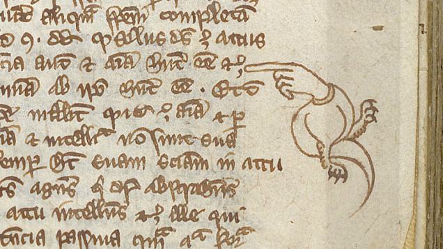
I have long been fascinated by medieval manuscripts, incunabula, and early books in general. Recently I stumbled upon a number of images that included manicules within text margins and thought —whence the manicule.
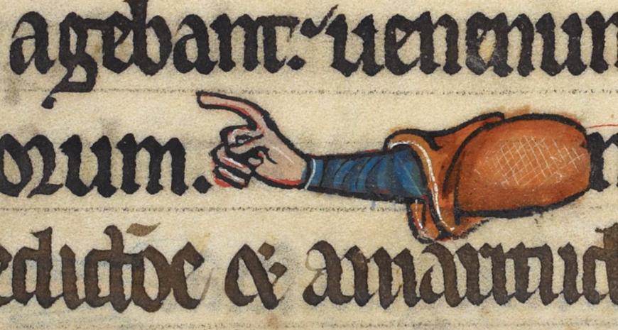
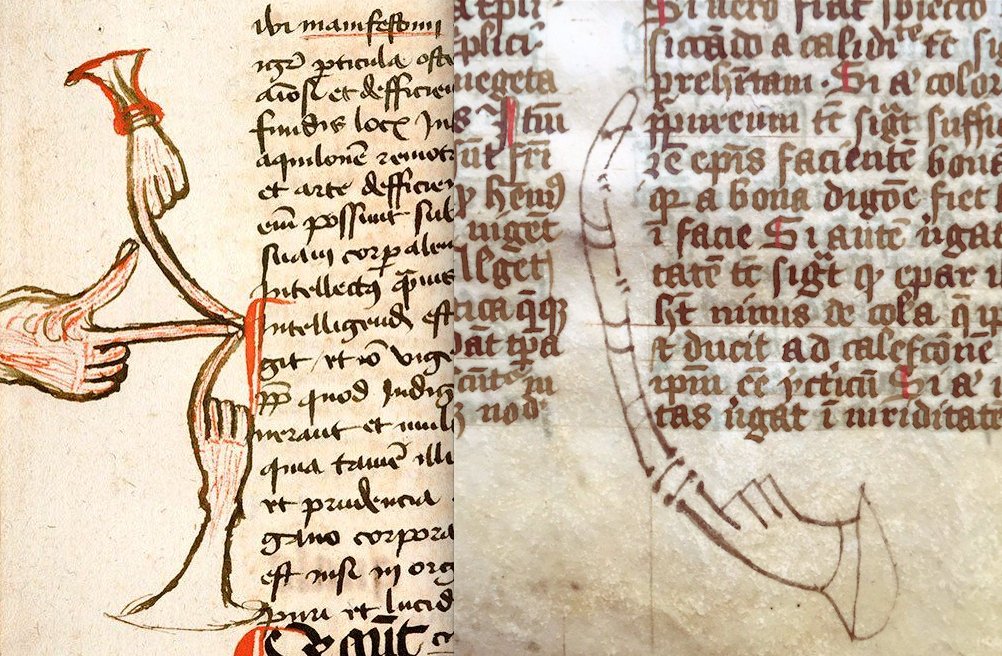
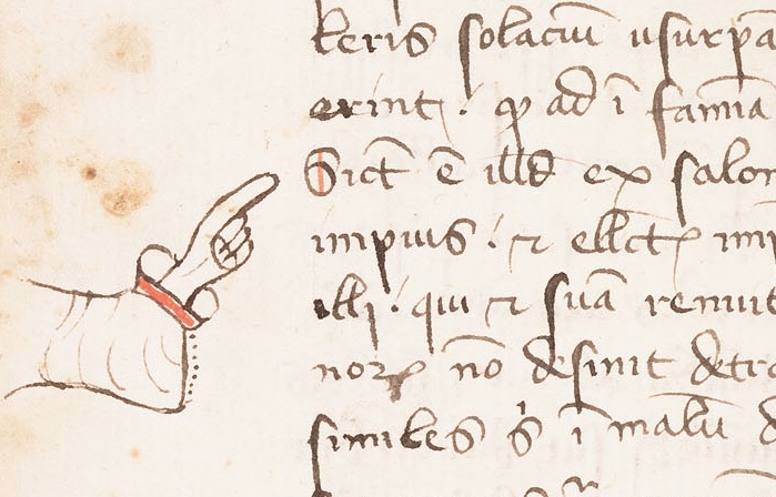
The manicule, , is a typographic mark with the appearance of a hand with its index finger extending in a pointing gesture. Originally used for handwritten marginal notes, it later came to be used in printed works to draw the reader’s attention to important text. 

The term manicule comes from Latin (maiculum) and means as much as small hand or pointing hand. The symbol is first used in the Domesday Book of 1086, which contained a comprehensive overview of all possessions and owners in England before and after 1066. It was commissioned by William the Conqueror for tax purposes. From then on, the symbol was used in the margins, margins of manuscripts, to indicate corrections or notes. This manicule was a popular symbol and they became more and more beautiful. Sometimes it was an ordinary bare index finger, sometimes with a beautiful cuff, sometimes with a crooked index finger.

After the printing press was introduced in the 15th century, the hand-drawn manicule continued to be used to indicate improvements to be made, or to point out an error in the text. Later, the pointing hand became more popular in publications, advertisements and signage. Even the U.S. Postal Service used the manipulative symbol when the letter was misdelivered and had to be returned to Sender .

In the 19th century the manicule became a popular typographic symbol . Today, the manicule is a standard typographic symbol intended to draw the reader’s attention to important text.


Posted in Art, Books, Europe | Tagged , , | 1 Comment

A Hieroglyphic Travel Guide

Regular visitors to Travel Between The Pages may recall that my niche market as a bookseller has long been travel guides and travel literature. I recently discovered this unique 1815 travel guide to Madeira and the Caribbean that is illustrated with a series of supplemental plates that contain sort of a first-mate’s log and the account of parallel trade voyage pictographically—with hieroglyphs, as the author states. These small drawings capture the sailor’s daily events during an 1814 voyage with a rather unusual story-telling device for the era and prefigure the concept of scripting in emojis.

The volume is titled The Traveller’s Guide to Madeira and the West Indies. Being a hieroglyphic representation of appearances and incidents during a voyage out and homewards. … With a treatise explanatory of the various figures, etc; 1815; Haddington, G. Miller and sons. The clever book employs a series of “hieroglyphic” plates to frame an account of a trade voyage. The illustrated pages display a calendar-like grid, for each day either a dot, to connote nothing of importance happened, or a little illustration summing up that day’s events. For a further explanation of these “emblematic figures” the author offers an “Explanatory Key”, which reads ostensibly as a regular journal recounting highlights from the course of days, except rather than under the headings of dates, they relate directly to the pictures and are so numbered. According to its anonymous author, referred to only as “a young traveller”, the plates came first, the motive for which was a “deficiency of time to note down my observances as they occurred”.

Posted in Art, Books, History, Maps, Writing | Tagged , , , | Leave a comment